How to build a Fixed Header and Navbar with HTML, CSS and JS

I am a Frontend Developer who is diving into writing to document my experience and also help others find their foot in the little way that I can.
One of the most common challenges that beginners face when starting out with web development using HTML and CSS is understanding how to create a header with navbar that remains fixed on the screen, even when scrolling.
I understand the challenges you might have faced when you were just starting out, such as constructing a semi-responsive header or dealing with issues like the main content overflowing into your fixed header. In this guide, I will walk you through the process of creating a fully responsive, fixed header using HTML and CSS from the ground up. This step-by-step approach will ensure you understand each stage of the development process. Let’s dive in!
Please note that throughout this tutorial, the terms ‘Header’ and ‘Navbar’ may be used interchangeably. Similarly, ‘our code’ and ‘my code’ might be used to refer to the same thing. This is to ensure a diverse yet consistent use of terminology in our discussion.
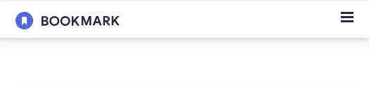
This will be the final version of what we will be building and to make it responsive, we will be using the mobile-first approach which entails building the interface for smaller screens first and then scaling up from there to other larger screen sizes.

Create Project Folder.
The initial step in this process involves setting up your workspace. Navigate to your directory of choice and create a new folder. Feel free to name this folder whatever you prefer, as it will serve as the foundation for our project.
open the newly created folder in your code editor. For this tutorial, I will be using VScode and I'd recommend you also follow along using it.
create three new files -
index.html,styles.cssandscript.jsin your opened folder.we will incorporate three distinct images. For the time being, feel free to select any image that fits your needs. Rest assured, we will supply the complete set of required assets upon the conclusion of this tutorial.
Set up HTML Structure.
The next line of action is for us to set up our HTML structure which depicts the skeleton of our webpage. In our HTML file, we perform some actions like linking our CSS file using the <link/> tag inside the <head></head> tag and also using the <script></script> tag to link the JS files so as sync every change made in all files together.
Your HTML file should follow this structure:
<!DOCTYPE html>
<html>
<head>
  <meta charset="utf-8">
  <meta name="viewport" content="width=device-width">
  <title>Fixed Header with HTML,CSS and JS</title>
  <link href="style.css" rel="stylesheet" type="text/css" />
</head>

<body>
  <header>
    <img src="/logo-bookmark.svg" alt="Logo">
    <nav>
    <ul id="nav">
      <li><a href="#">Features</a></li>
      <li><a href="#">Pricing</a></li>
      <li><a href="#">Contact</a></li>
      <li class="login"><a href="#">Login</a></li>
    </ul>
    </nav>
    <img id="menu" src="/icon-hamburger.svg" alt="Hamburger icon">
  </header>
  <script src="script.js"></script>
</body>
</html>
Open webpage with Live Server
After doing all this, spin-up your code on the browser so as to see the content of your code. Since were using VScode, we can use an extension called Live Server to accomplish that. If you don't have the extension installed, go to the extension tab and search for it.
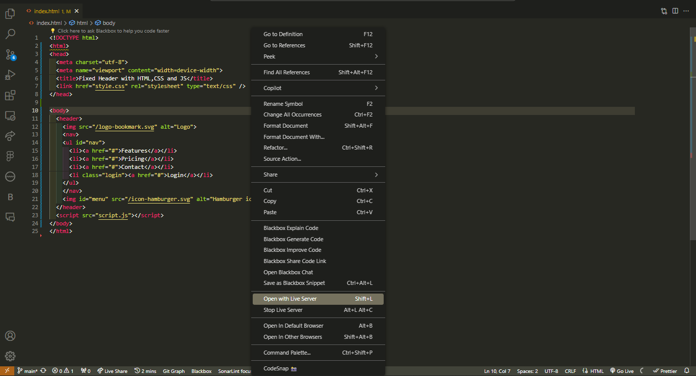
After completing the above steps, your browser should display your HTML contents like this:

Styling for Mobile Screens
As we can see our page looks ugly, we can fix that by adding some styles through the previously created styles.css file we linked earlier to our HTML file. Since we are following a mobile-first approach, we will write styles for smaller screens first which will mean that only the logo and hamburger menu will show by default and the nav element will be hidden automatically. The nav elements will only show when the hamburger menu is clicked (this functionality will be achieved using a bit of JavaScript later).
Reset the default styles in our code by adding these code
* {
  padding: 0;
  margin: 0;
  box-sizing: border-box;
}
Add a position property and value of fixed to our header element to make it fixed to the top of our screen.
header {
  position: fixed;
  top:0;
  left:0;
}
Add to other styles to make the layout cooler and responsive.
header{
  width: 100%;
  height: 40px;
  padding: 0 10px;
  display: flex;
  justify-content: space-between;
  align-items: center;
  background-color: #ffffff;
  box-shadow: 0 0 4px #212121;
  z-index: 10;
}
We give the header a mandatory width of 100% so as for it to span through the entire screen as well a fixed height of 40px. A z-index of 10 (always used with a position property) is also given to the header so as to give it higher preference in the stacking order of all elements.
- Now, we also add styles to the
ulelements which hold the navlinks. We first add a display of flex (we will later automatically hide the element on mobile by giving it a display of none).
header ul {
 /* display: none;*/
    display: flex;
}
- Then, we add other additional styles for the layout of the navlinks for mobile screens. We give it an absolute position and move it using the top and left property and then make it span through the width of the screen by giving it a relative width of 100% and a minimum height of 200px.
header ul {
  position: absolute;
  left: 0;
  top: 40px;
  background-color: hsl(229, 31%, 21%);
  opacity: .9;
  width: 100%;
  min-height: 200px;
  padding: 20px 0;
  flex-direction: column;
  justify-content: space-between;
  align-items: center;
  list-style: none;
  color: #fff;
  transition: 1s ease-in-out;
}
- The individual
liitems are then given these styles;
header ul li {
  font-size: 14px;
  cursor: pointer;
  text-transform: uppercase;
}

.login {
  border: 2px solid white;
  color: #fff;
  padding: 8px 0;
  text-align: center;
  border-radius: 6px;
  min-width: 100%
}
- Your webpage should look like this after applying the above styles.
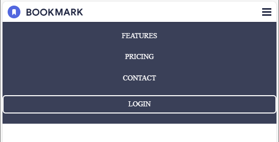
- Since we can see this is looking good now, we can now take a step back above and remove the
display: flexon theheader ulelement as well as uncomment thedisplay: none.
Styling for Larger Screens
Now that we are done with styling for small/mobile screens, the next line of action is to make the header and navlinks responsive in larger screens also. To accomplish that we also have to specify styles using something called media queries. Inside the media queries, we target breakpoints (screen sizes we want specific styles to apply to). In our case, we are going to target screen sizes with a minimum width of 768px (the styles will only apply to screens equal or larger than 768px)
@media screen and (min-width: 768px) {
  header {
    height: 80px;
    padding: 0 60px;
  }
  header ul {
    column-gap: 16px;
    display: flex;
    flex-direction: row;
    top: 0;
    left: 0;
    width: auto;
    opacity: 1;
    position: relative;
    background-color: transparent;
    color: #000;
  }
  header ul li {
    font-size: 16px;
  }
  .login {
    padding: 8px;
    background-color: #FA5757;
    border: none;
    min-width: auto;
    text-align: center;
  }
  #menu {
    display: none;
  }
}
We add styles to hide the hamburger menu since we won't be needing it on larger screens as well as modify other styles for responsiveness.
We are only targeting one breakpoint in this tutorial; you can target other breakpoints to make the responsiveness more robust.
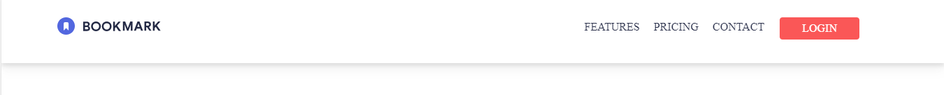
The webpage on larger screens should now look like this;
Toggling Navbar with JavaScript
We can remember the navbar is automatically hidden in mobile screens although it has been styled already. Now to add opening and closing of our navbar by clicking the hamburger menu on mobile screens, we will need to write a little bit of JavaScript code to add interaction to our webpage.
Before we dive straight into the muddly waters of JS code, we need to add one last piece of code into our CSS file because we will be using it in our JS code.
.show {
  display: flex;
}
After adding this, we can now add these lines of code also in our script.js file.
let navLinks = document.getElementById("nav");
let hamburgerMenu = document.getElementById("menu");

hamburgerMenu.addEventListener("click", () => {
  navLinks.classList.toggle("show");

  if (navLinks.classList.contains("show")) {
    hamburgerMenu.src = "/icon-close.svg";
  } else {
    hamburgerMenu.src = "/icon-hamburger.svg";
  }
});
What the first two lines of code does is that firstly we first get a reference to the nav-links and hamburger menu by selecting them using the document.getElementById method through the id (nav and menu) we gave them in our index.html file.
We then attach a click event listener to the hamburger menu that triggers whenever the menu is clicked. This line here navLinks.classList.toggle("show") adds the .show class style we created earlier to the navLinks thereby showing the navlinks and also removes it if the .show class exist in the navLinks class already i.e. it toggles it.
The next lines of code is a conditional statement that checks whether the .show class is present in navLinks elements. If it is present, the hamburger menu src property is changed to that of the hamburger close menu image and vice-versa. This is done to give a visual representation of the action being done at the moment.
Conclusion
This post addresses how to build a fixed and responsive Header/Navbar using HTML, CSS and JavaScript. Watch this space for the upcoming ones.
The full source file of this tutorial can be found here as well as the image assets used.
I'd love to connect with you on Twitter | LinkedIn | GitHub | Portfolio.
See you in my next blog article. Take care!!!

